Make local services feel simple to discover and book.
The product needed to move from open-ended browsing into informed action: choose a category, compare options, trust the provider, and pay.
A mobile UX/UI system for discovering nearby services, comparing providers, managing payment methods, and moving from intent to booking with less friction.
The product needed to move from open-ended browsing into informed action: choose a category, compare options, trust the provider, and pay.
The UI work connected home discovery, service cards, provider sheets, wallet setup, and account states into one consistent mobile system.
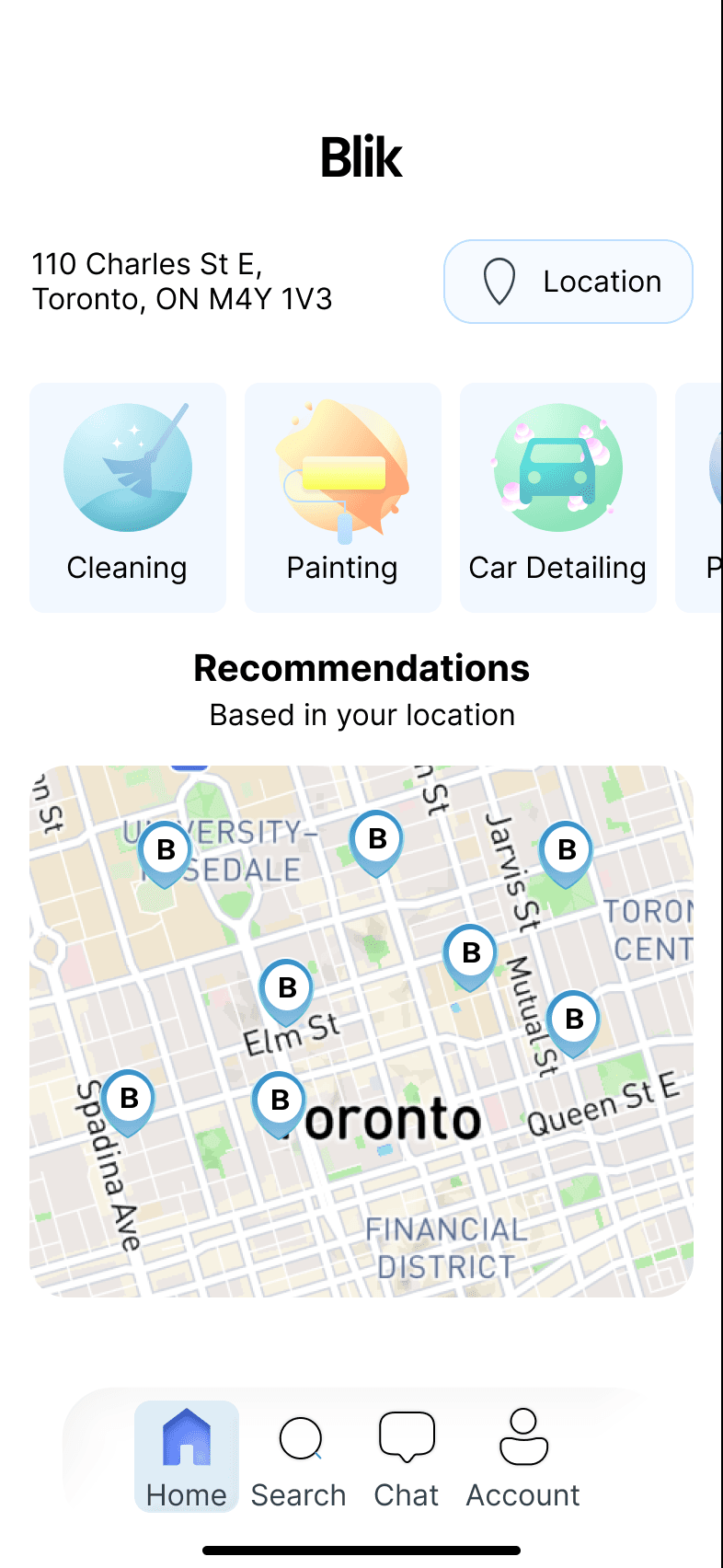
Blik’s first job is orientation. The UI gives users a location anchor, clear service categories, and nearby recommendations before asking them to make a decision.
The hierarchy moves from place, to need, to nearby provider so the user never has to start from a blank search state.
Location and map context appear before the product asks for a commitment, making service discovery feel grounded.
Service cards use soft color, iconography, and compact labels so users can scan options without reading long descriptions.
The home screen introduces nearby providers as the next step, reducing the distance between browsing and booking.
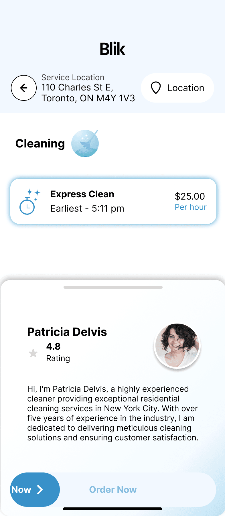
Service detail and provider selection screens reduce hesitation by pairing practical data with a more human moment of trust.
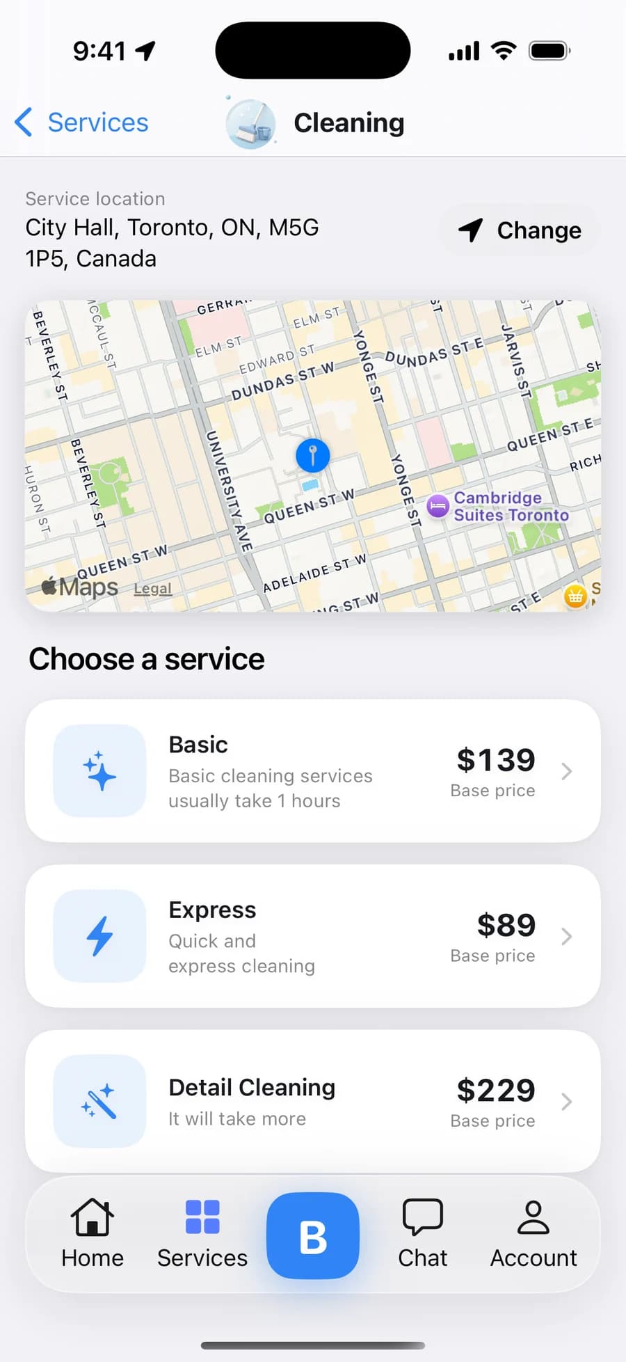
Every option carries a base price before anyone is contacted — Express $89, Basic $139, Detail $229 — with the service location pinned above so comparing never loses its context.
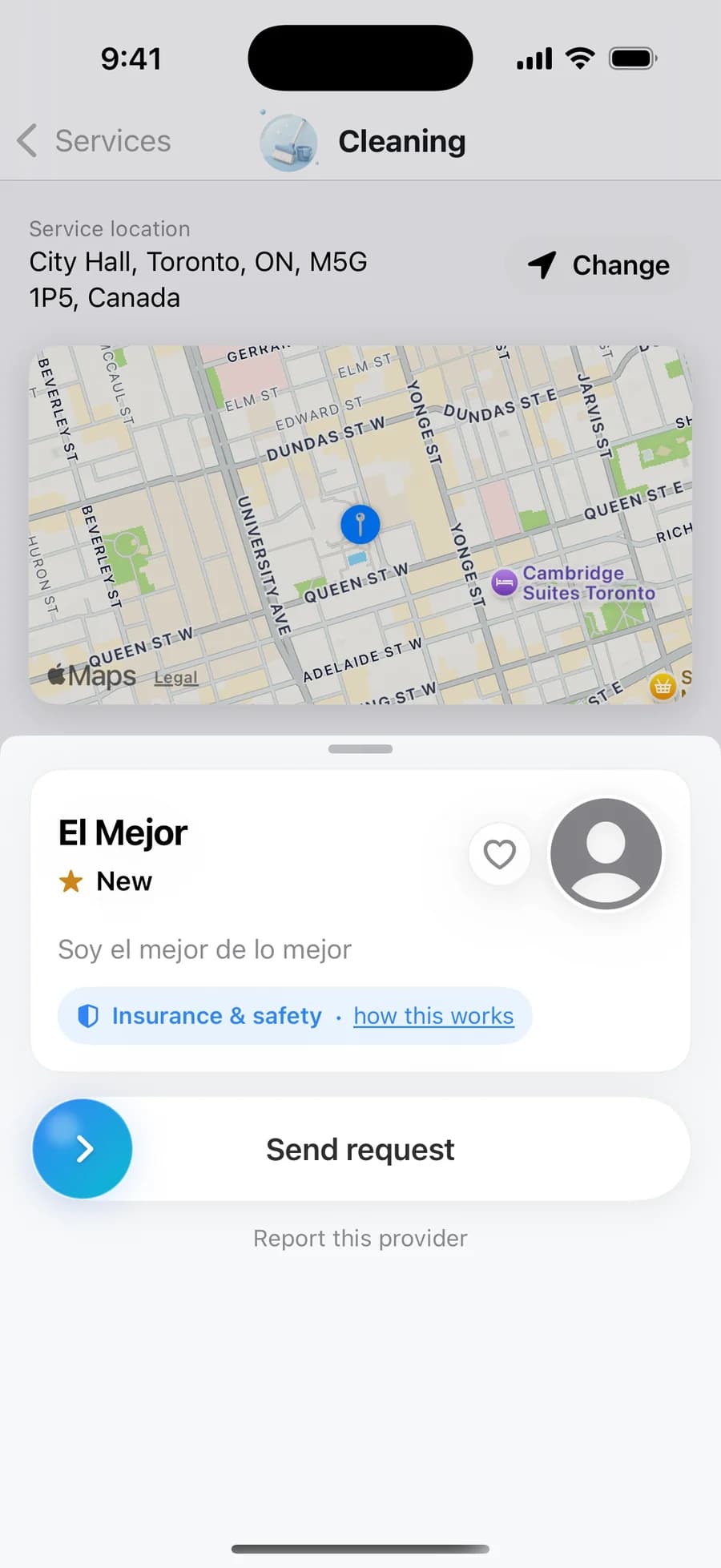
Rating, bio, the insurance line, and a report link are grouped around one button — Send request — which starts the 90-second dispatch to that provider.
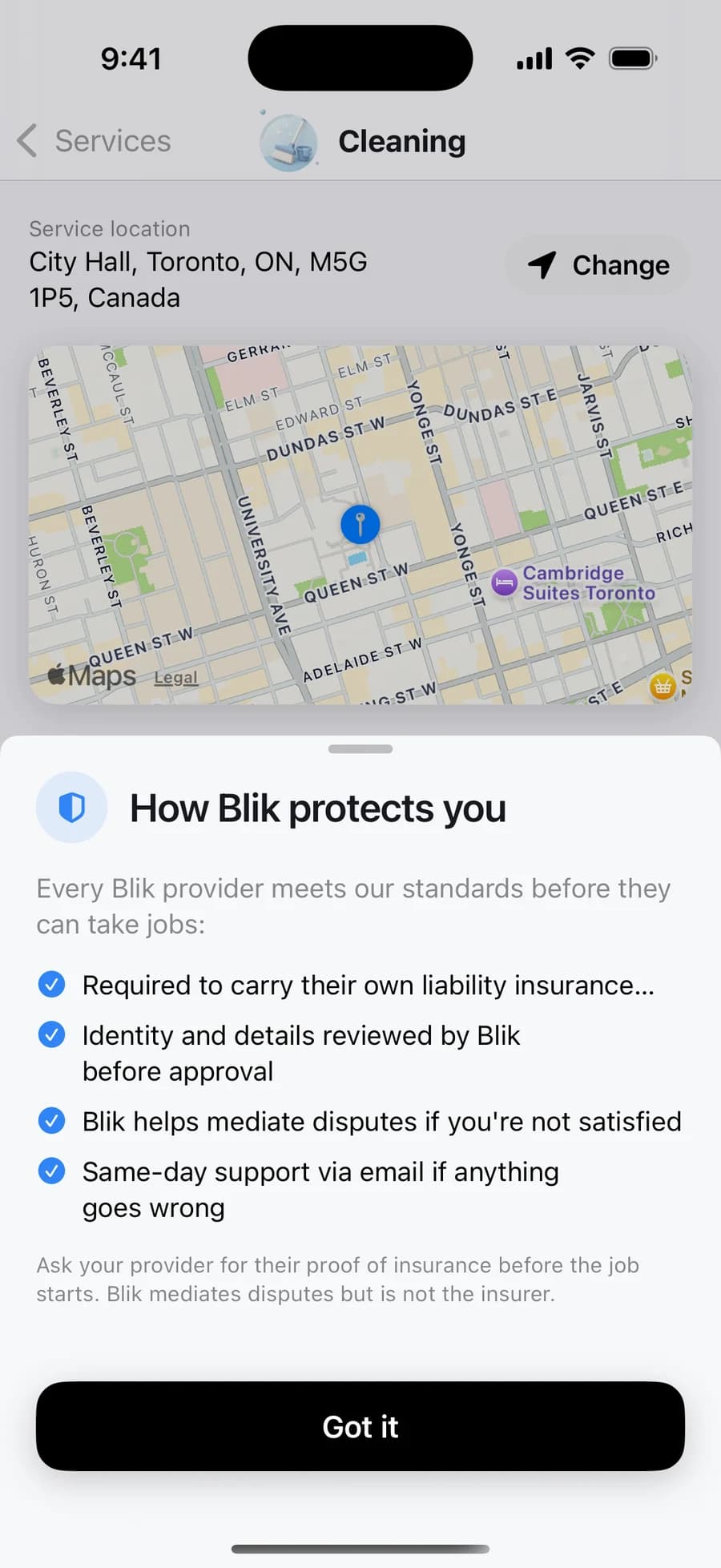
One tap from the order action: every provider carries their own liability insurance and is reviewed before approval, Blik mediates disputes — and says plainly that it is not the insurer.
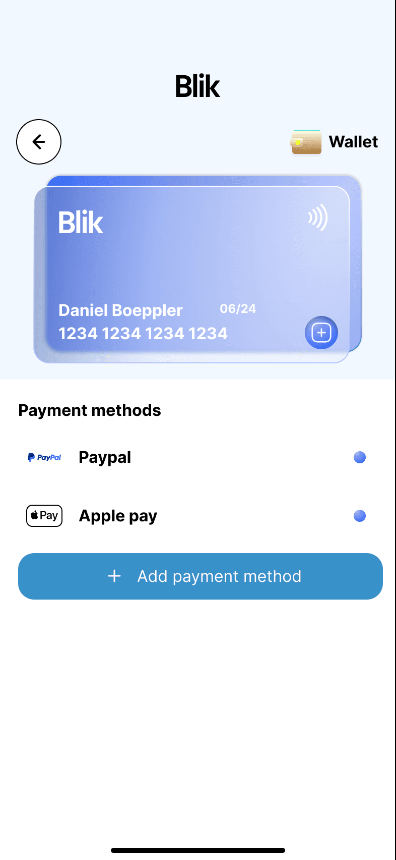
The wallet screens separate setup from saved-method management, so users can add, review, and trust payment options without decoding a dense settings page.
The layout gives Apple Pay, PayPal, and card entry distinct rows instead of hiding payment setup in a generic form.
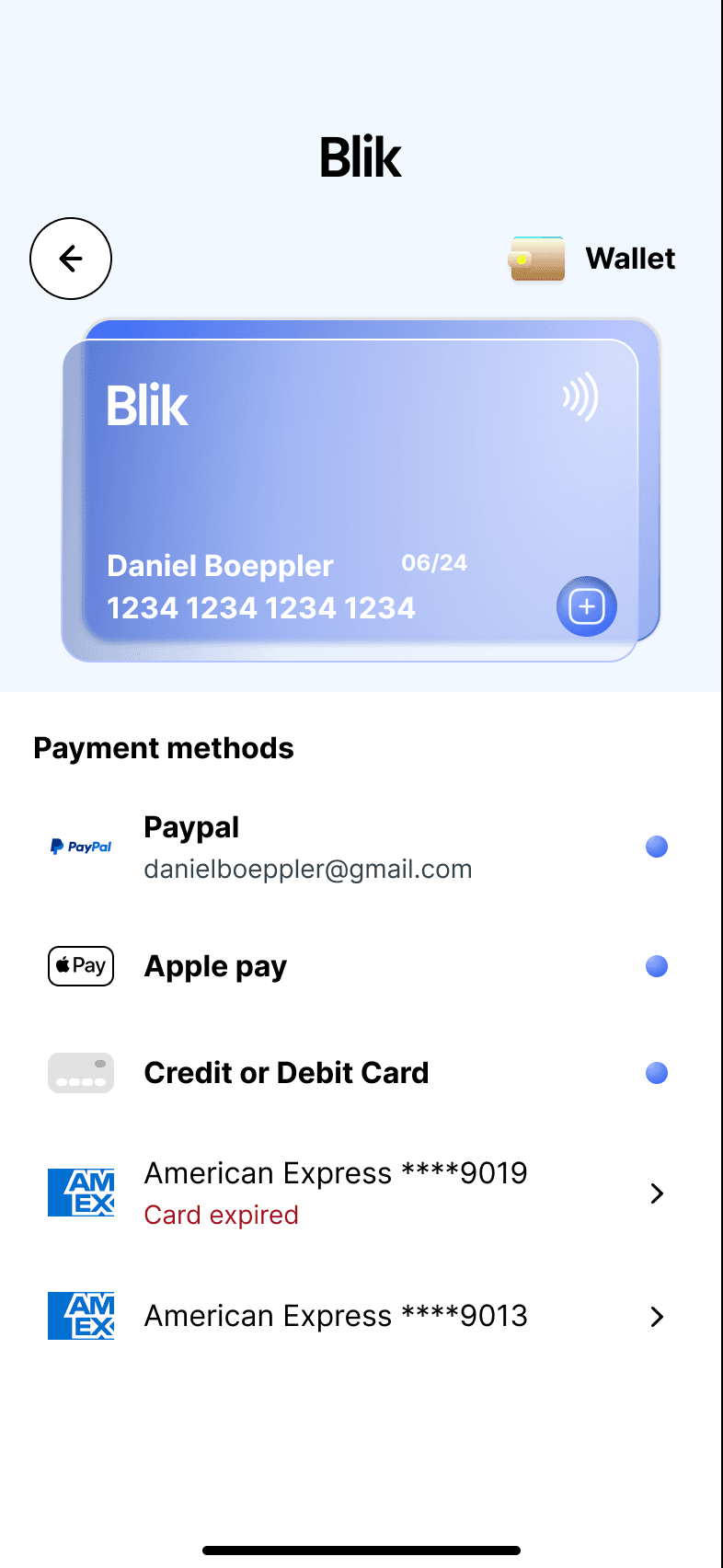
Payment state is designed to prevent surprises before booking, which is especially important in a local service flow.
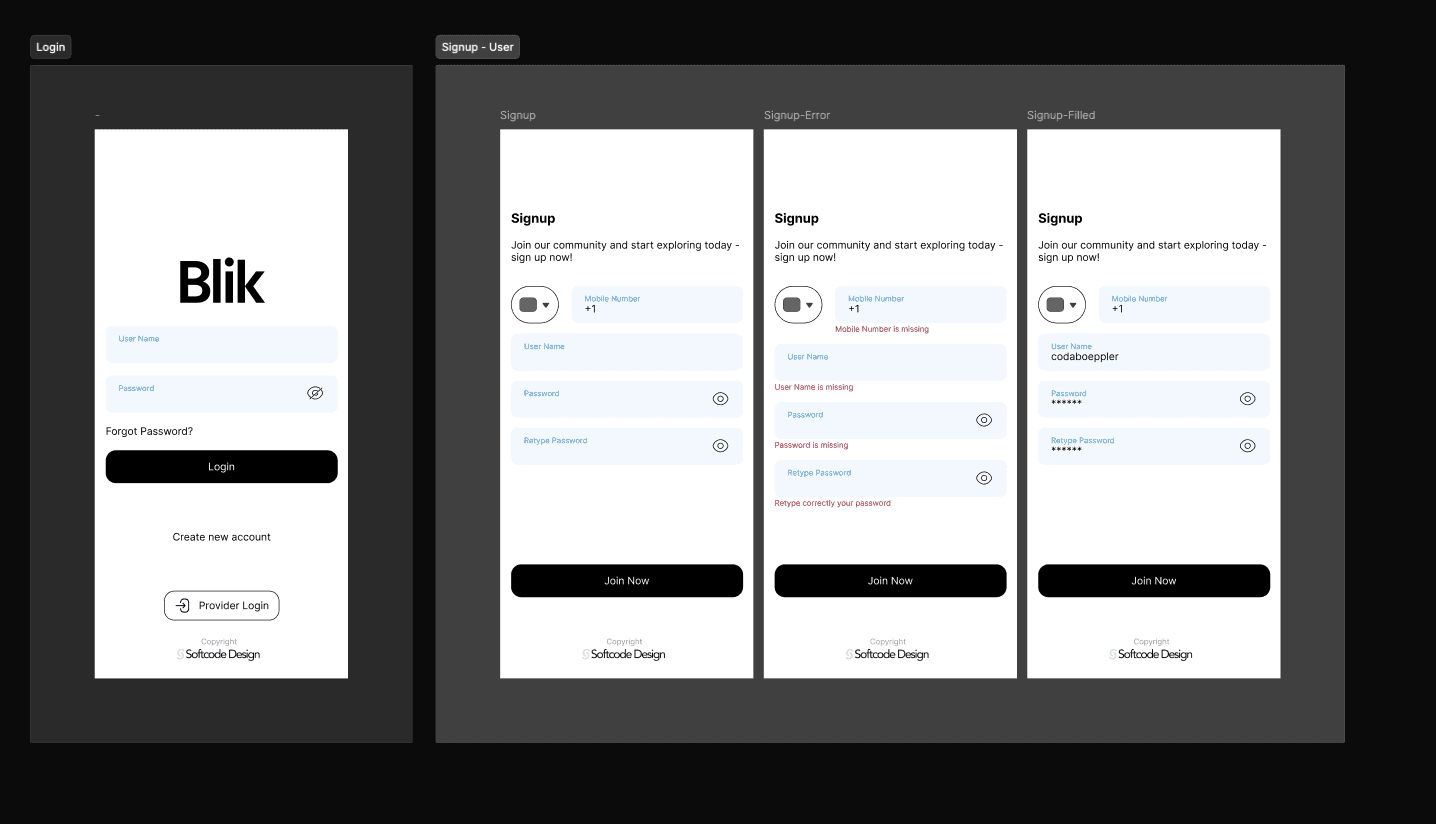
Entry forms inherit the same soft system language, so account creation feels like part of Blik instead of a disconnected utility screen.
Blik only works when both sides trust the middle. Switch between the customer and the provider journey to see how the same system serves each of them.
The customer side is built to remove hesitation: orient first, compare in context, meet the person, then pay in a way that can't surprise you.
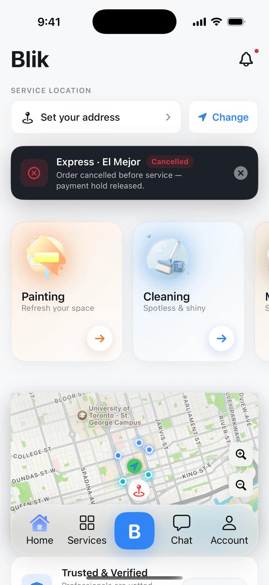
A compact carousel of the screens that explain the UX: discovery, comparison, provider context, wallet state, and account entry.
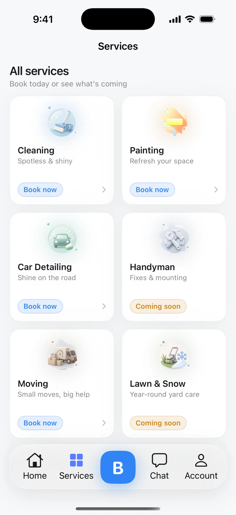
A capture from the production build — the Services tab with the current category set, direct Book now entry points, and honest Coming soon states for Handyman and Lawn & Snow.
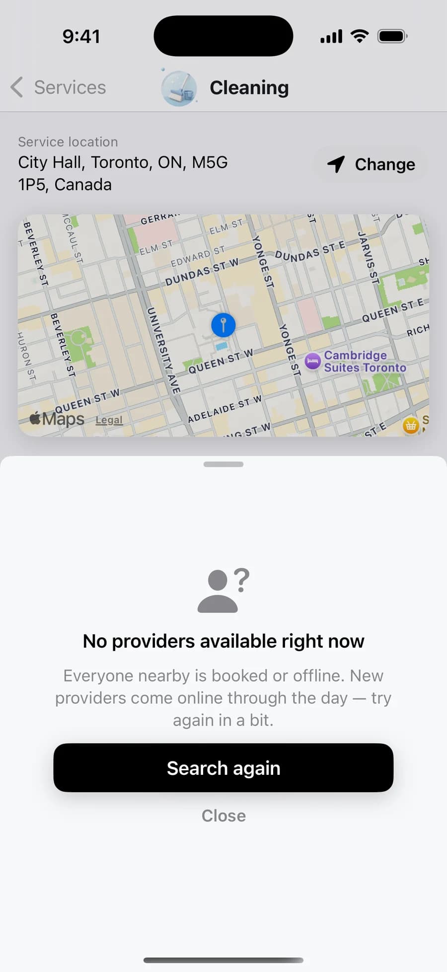
A real capture of the no-provider state: a plain explanation, a Search again action, and the customer's location and service kept intact so retrying costs nothing.
The home screen keeps discovery lightweight: set location, scan service categories, then move into nearby options without a heavy search form.
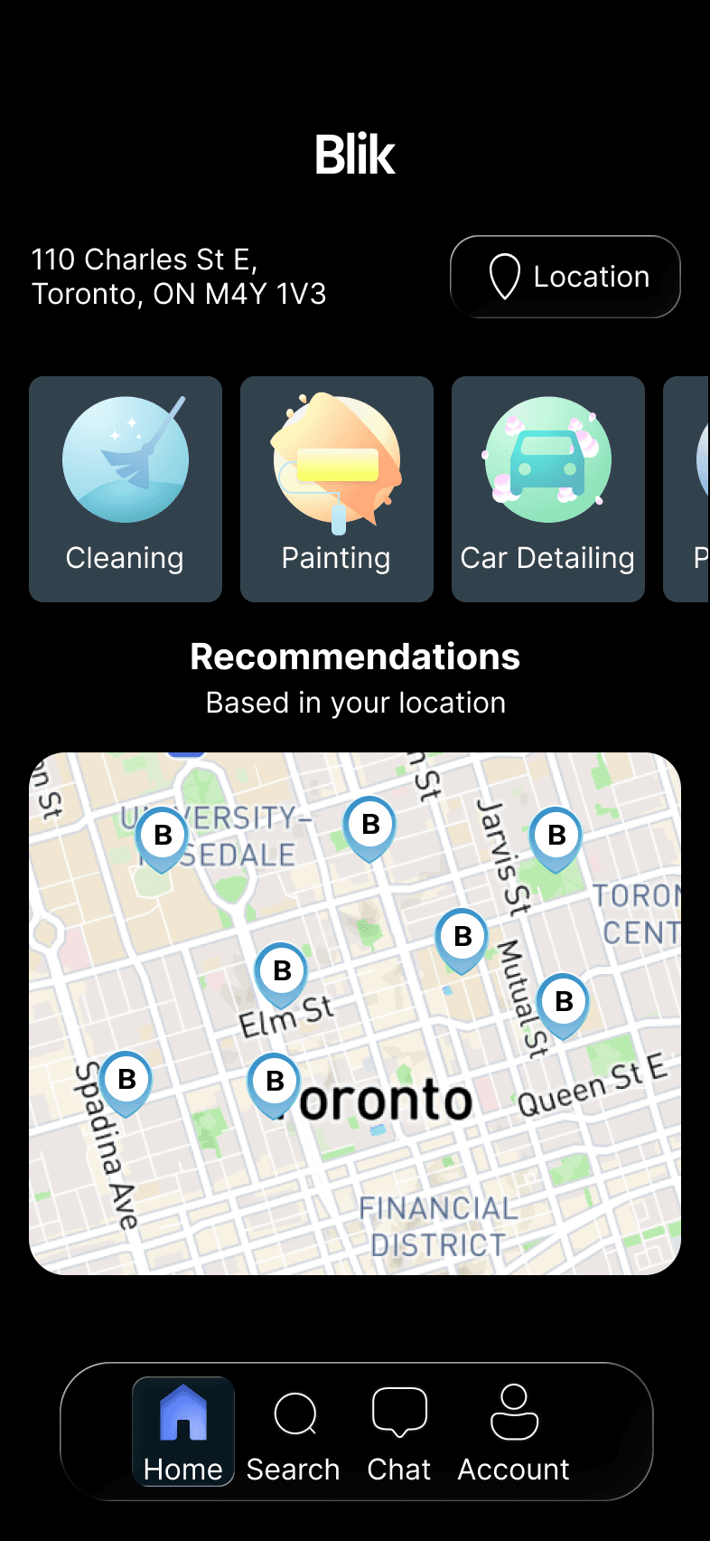
Category cards, map context, and bottom navigation keep the same structure so the product feels connected across visual modes.
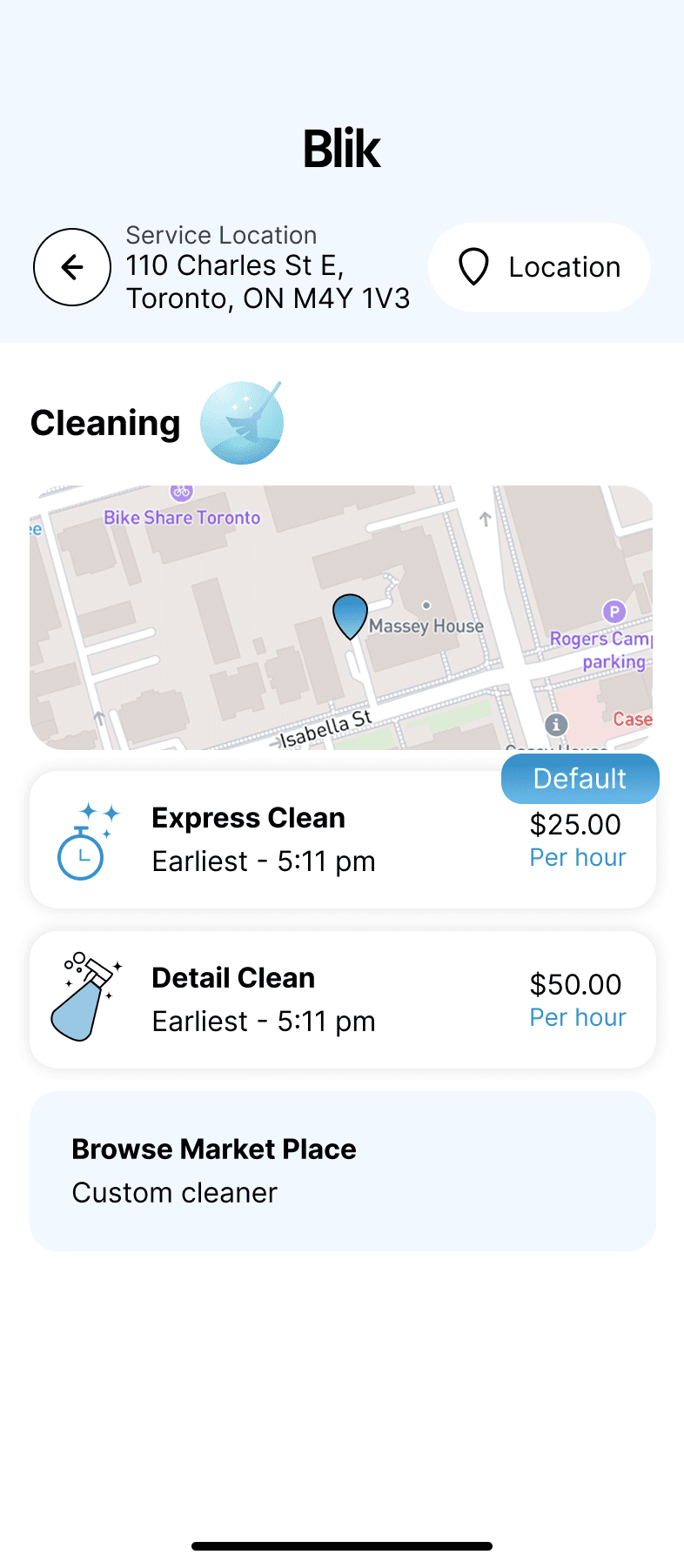
The Cleaning detail screen pairs price, distance, map context, and service options so users can compare without jumping between screens.
Ratings, distance, price, and a short provider profile are grouped near the action so the next step feels informed, not rushed.
Payment methods are separated into recognizable options, with a clear add-card path and enough visual breathing room for trust.
The wallet list distinguishes PayPal, Apple Pay, active cards, expired cards, and primary payment state without overloading the screen.
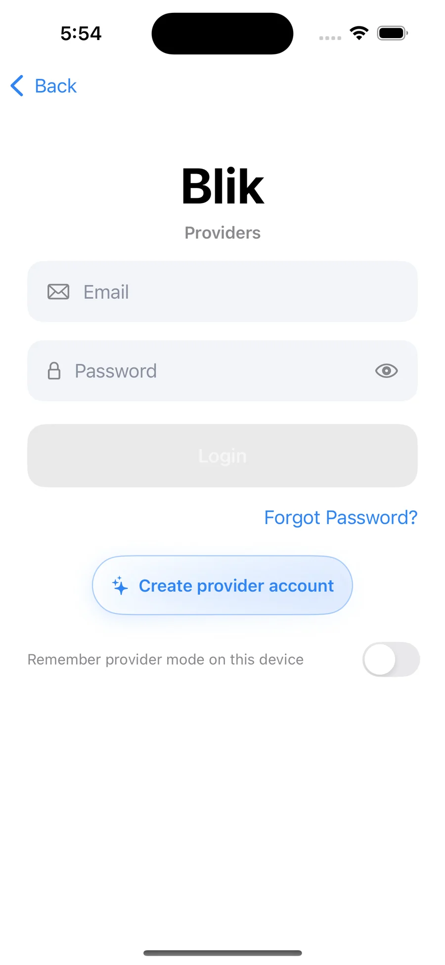
A dedicated provider login with a remember-provider-mode toggle keeps the two sides of the marketplace from blurring on a shared device.
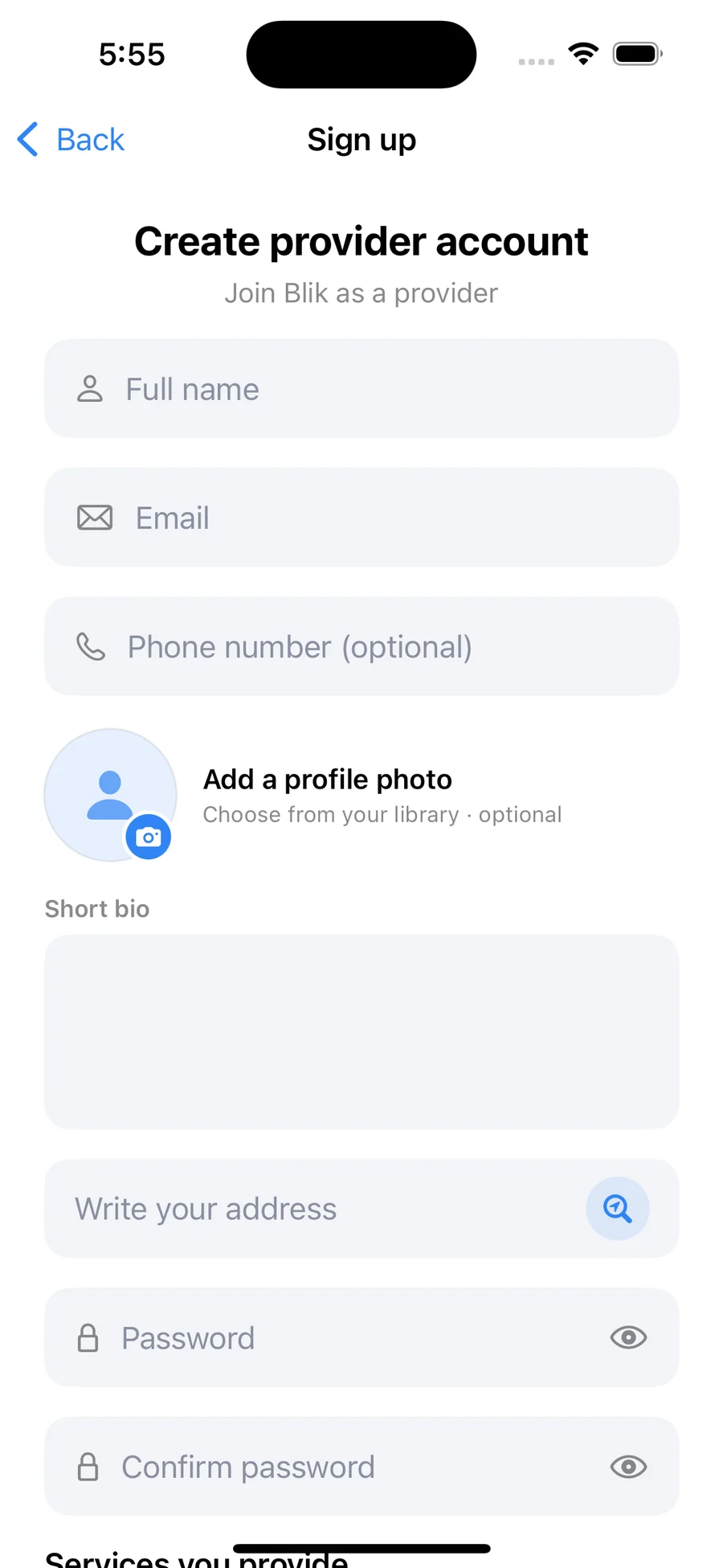
Name, contact, photo, a short bio, and the service address — the same fields customers later see on the provider sheet, captured once.
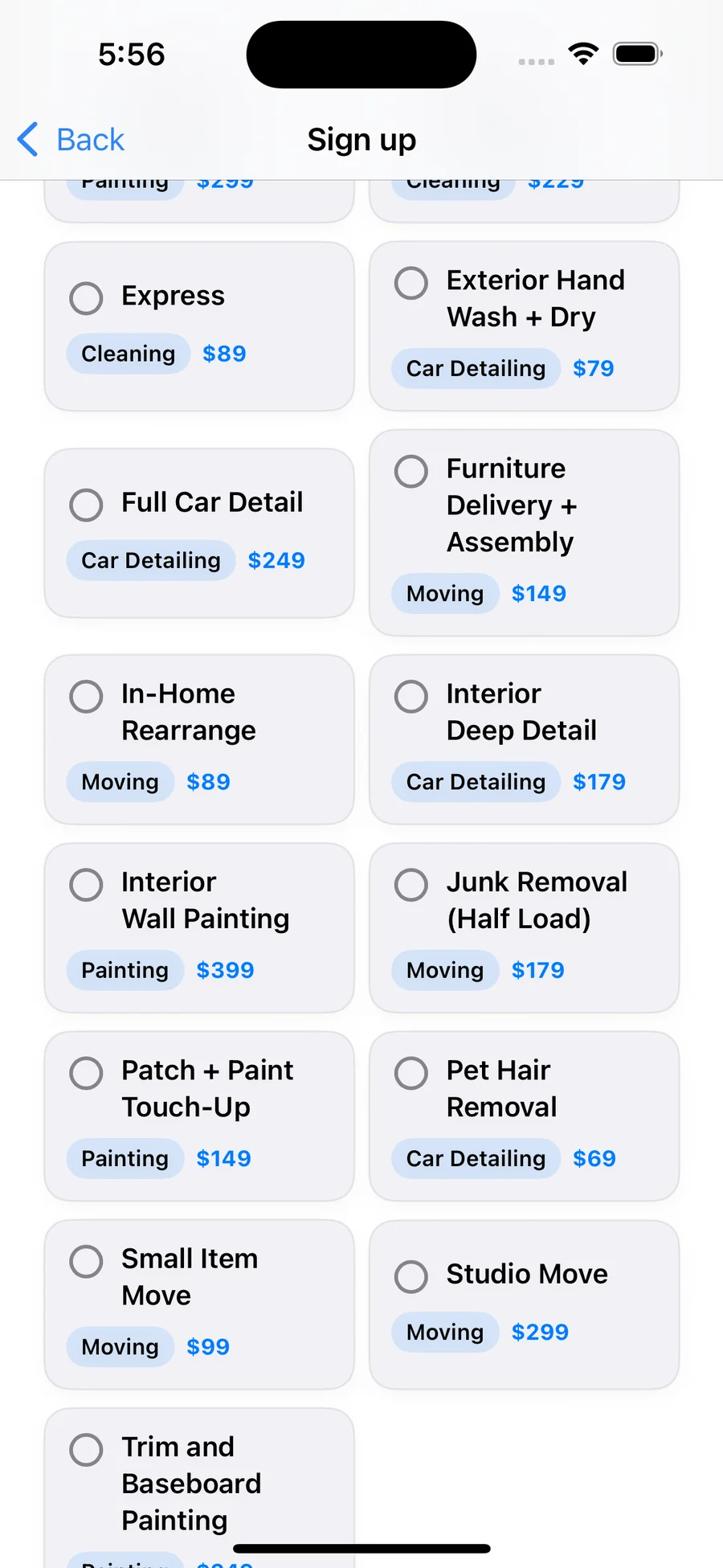
Services are chosen from the same catalog customers book from, so a provider's listing, the customer's price, and the payout math all start from one source.
The login and sign-up work established field styling, hierarchy, and error-ready structure before the user reaches the core app.
The app shipped first; the website followed as the surface that explains the ecosystem to people who haven't opened TestFlight yet. The two share type scale, blue/lilac accent palette, soft-card hierarchy, and the same micro-stats (98% response, 4.9/5, under-2-minute booking) so the brand reads as one product, not a deck plus an app.
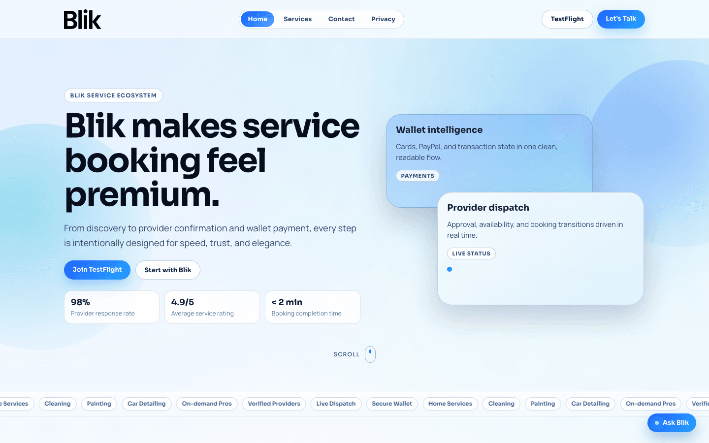
The hero pairs the brand promise (“service booking feel premium”) with three credibility chips (response rate, rating, time-to-book) and immediately surfaces the two real conversion paths — Join TestFlight for end users, Start with Blik for service providers.
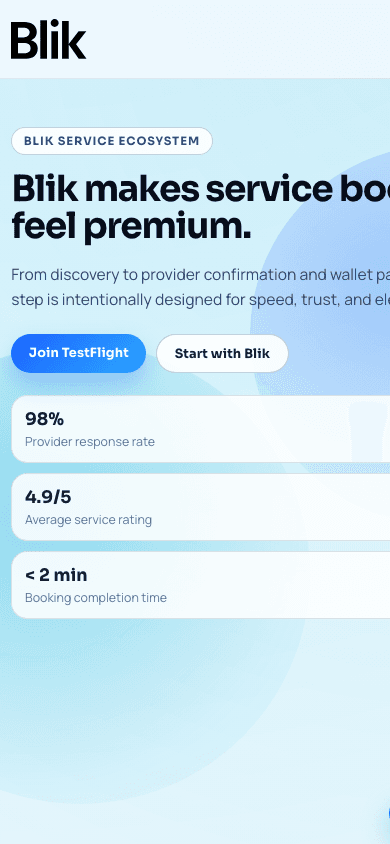
Same hierarchy, smaller frame: title, dual CTAs, then the proof chips. No side-scrolling, no hidden value props.
The work split into four overlapping phases — research first, then structure, then surface, then validation. Each phase produced an artefact the next phase consumed, so handoffs were lossless and the team always had something concrete to react to.
Studied how on-demand service apps (TaskRabbit, Thumbtack, Jiffy, regional cleaners) handled the four hard moments — service discovery, provider trust, wallet setup, booking confirmation — and mapped where each one leaked users. Findings became the problem statement: shoppers abandon when they can't verify the provider quickly and when payment setup feels like a separate journey.
Sketched the four core flows — Discover → Compare → Book → Pay — and pressure- tested each step against the audit findings. Provider quality controls and live dispatch surfaced as system primitives that needed first-class UI, not buried metadata.
Wireframes in Figma, then a light + dark interface system around a calm blue/lilac palette and a soft-card hierarchy that keeps long-form info readable. Motion was spec'd at component level (provider sheet, wallet drawer, dispatch states) so engineering had real specs, not guesses.
Prototype tested with five service-booking customers and three providers; iterated the comparison sheet copy and the wallet add-method flow based on what they got stuck on. The marketing site at theblik.ca followed once the in-app language was stable, so the brand outside the app matched the brand inside.
The Blik interface connects discovery, comparison, booking trust, and payment state into one focused mobile journey.
Good service UX helps people move from “what do I need?” to “I can book this.”