
Don't make someone operate two screens during a set.
The phone is a good place to choose a workout. Mid-session, it is often on the floor. I wanted the wrist to answer the immediate question without asking someone to pick the phone up.
Designing for the seconds between sets.
I built the dial that opens the day, the timer you check between sets, and the visual language that makes them feel like one product.
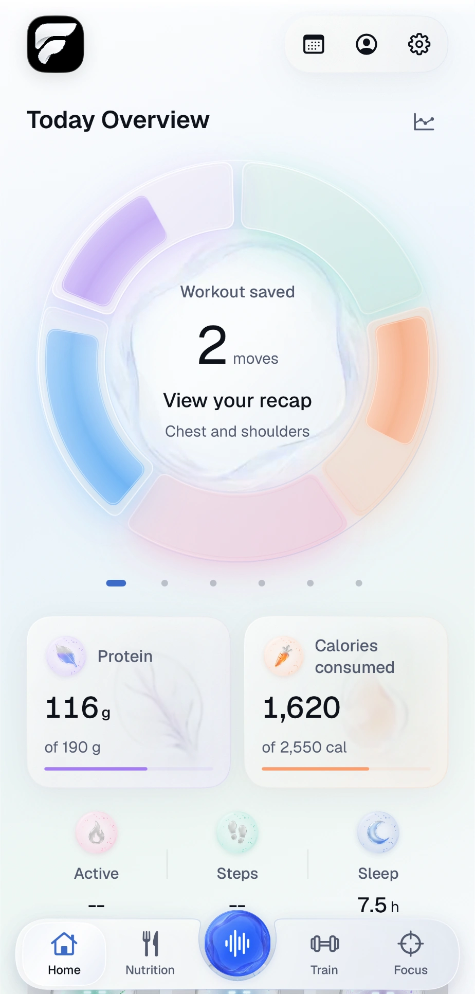
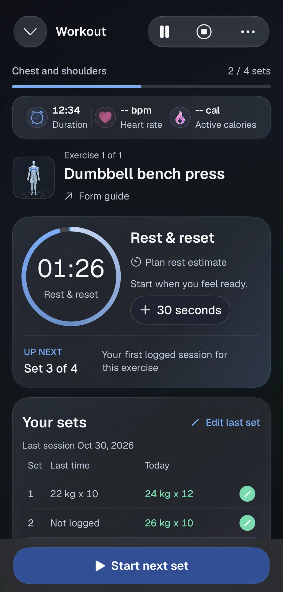
I wanted the app to feel like FitProofs even when only one number fits on the screen. The daily dial, the rest timer and the Watch set editor share the same type, surfaces and motion. The atomic library documents 60 native components against 24 iPhone and 19 Watch captures.
Which values change between pearl and charcoal, and which signal stays the same.


Workout, nutrition and focus each have a distinct character and response to input.



Workout, food and focus rewards, with locked and earned treatments.
The phone is a good place to choose a workout. Mid-session, it is often on the floor. I wanted the wrist to answer the immediate question without asking someone to pick the phone up.
I set the hierarchy, moved body exploration out of Settings, and directed the light and charcoal treatments. I also kept a manual review step where a sensor or photo could give the wrong answer.
The wrist is good at a glance. The phone is where I can check a portion, correct a set, or look back through a day. These four journeys use native simulator captures with example data, not a personal activity log.
The task
Design decision / 01
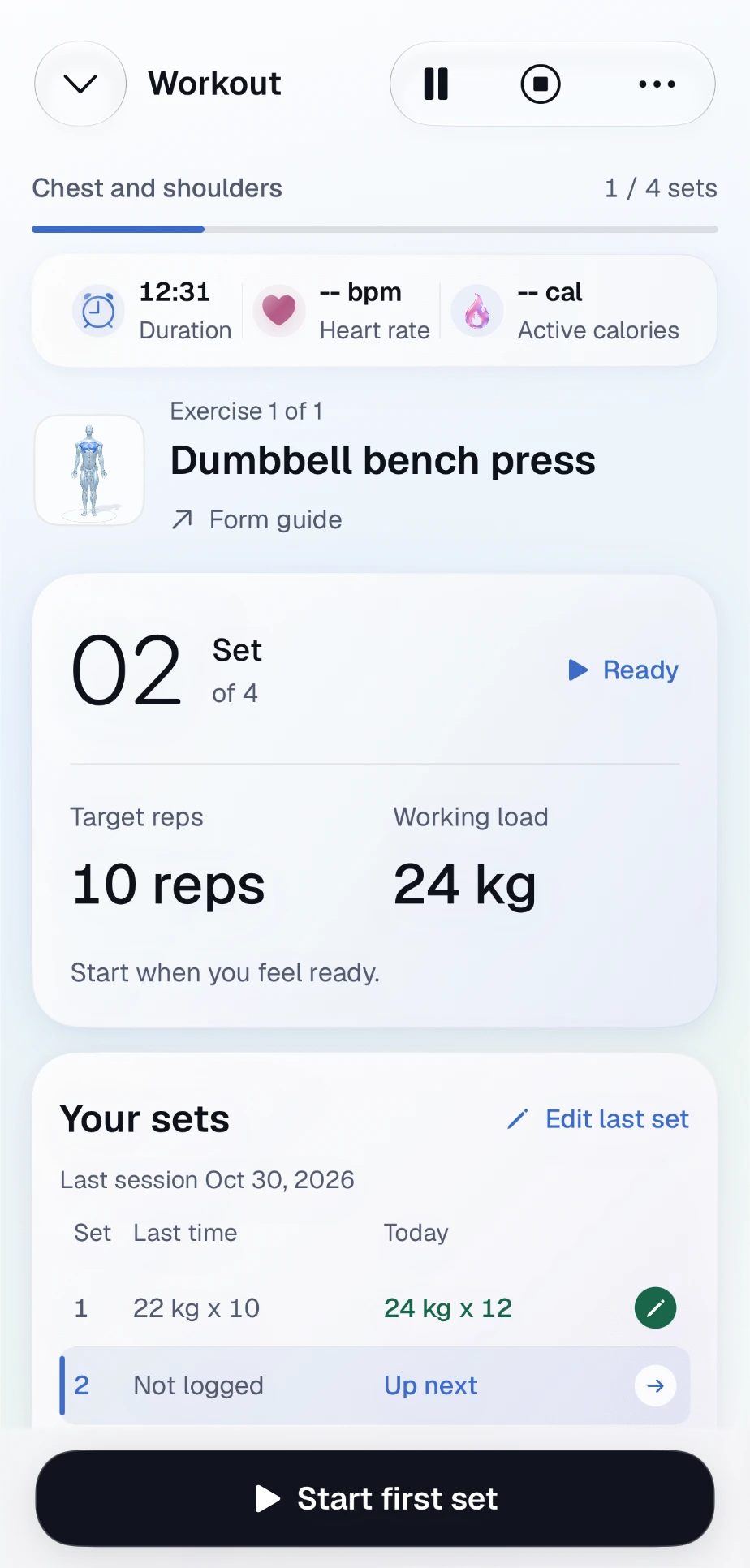
The ready screen puts the target reps beside the working load. The set below still says “Not logged”. I wanted a plan to be useful without letting it quietly become a workout record.
These are findings from using my own builds, not a study of other lifters. For each one, I wrote down what happened before deciding how the design should respond.
I added rest on my iPhone and the Watch kept counting down to the old time. Looking at either screen alone, nothing looked broken.
Steps and sleep updated while active calories did not. A general “Health connected” status couldn't tell me whether this particular reading had arrived.
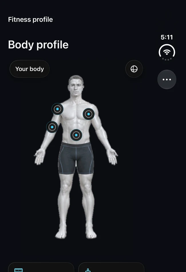
I kept going through Settings to reach Body. Once there, a selector asked me to name a muscle I could already point to.
Working on a similar handoff between devices? Discuss a mobile UX project.
Here is the same meal editor in charcoal, with the same example portion and macros. In the solid treatment the boundary becomes more distinct. The food name, gram control and four nutrient values keep their positions, so reading the solid version doesn't mean learning a second layout.
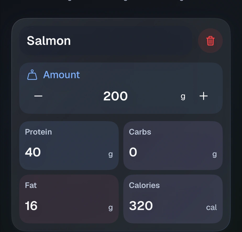
Tint and a soft edge separate the food from the meal sheet.
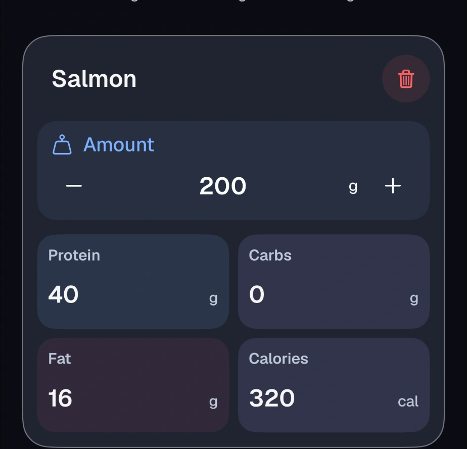
The solid surface and outline separate the same controls without relying on translucency.
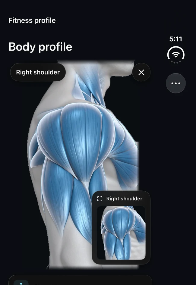
I removed the playback controls and asked for a direct tap on the body. Blue fibres identify the selection; a second, smaller view makes its shape easier to inspect. These are two captures from the charcoal design iteration.
The number that matters changes during a workout. In a working set it is the rep count. Between sets it is the remaining rest time. In review it is the count you can correct. These are simulator captures with example data.
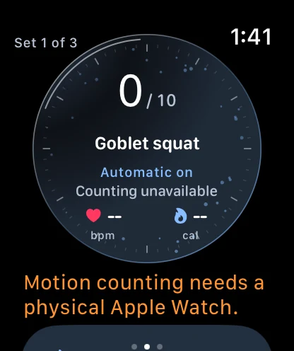
Keep the exercise and set in view.
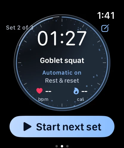
Give the remaining time the strongest contrast.
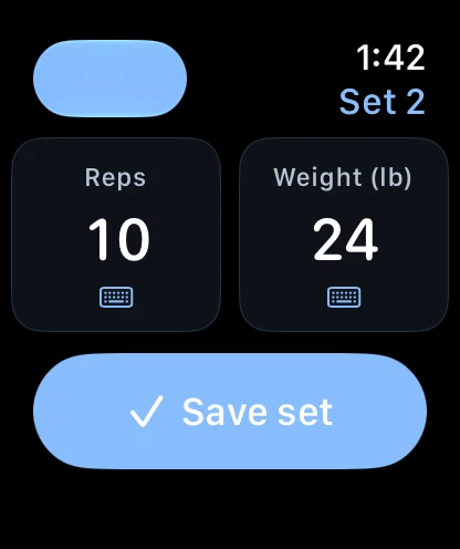
Let the lifter correct the set before saving.
These are not live Apple Watch accuracy figures. The research model was not added to the Watch app on the strength of this benchmark.
I'd test the recovery moment first.
A lifter holding a partial rep and one resting between sets can both look still. Before adding another automatic transition, I'd test what happens when the Watch guesses wrong and the person needs to recover.