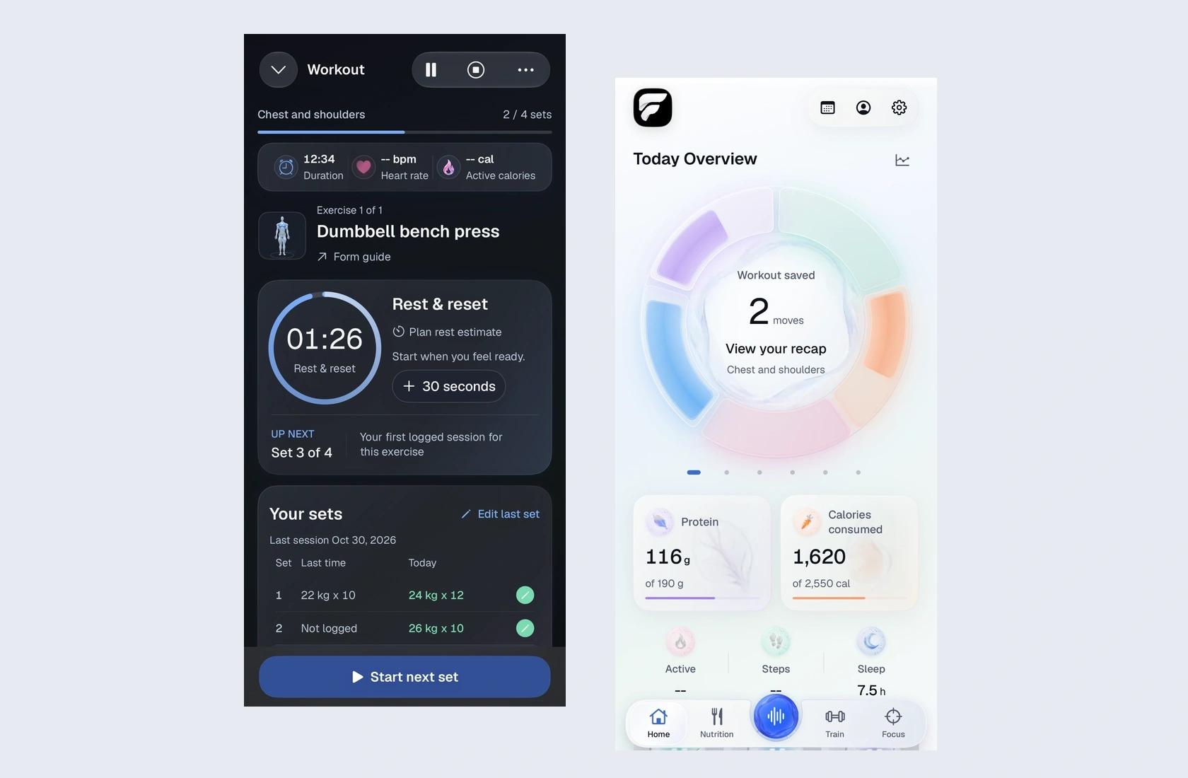
One of my most useful pieces of feedback on FitProofs was also one of the shortest: why did I have to go into Settings to see my body profile?
The screen already existed. Making it prettier would have done nothing for the person who couldn't find it. I wanted it within reach from Home, and I wanted the tabs to stay put when it opened. Looking at a shoulder shouldn't mean losing your way back to a workout.
A body is a better menu than a list of muscles
The early profile had a figure in the middle, cards beside it, and a selector at the top. To look at a shoulder, you could be looking right at it and still have to read a menu. My direction was to remove the selector and let the shoulder itself be the target.
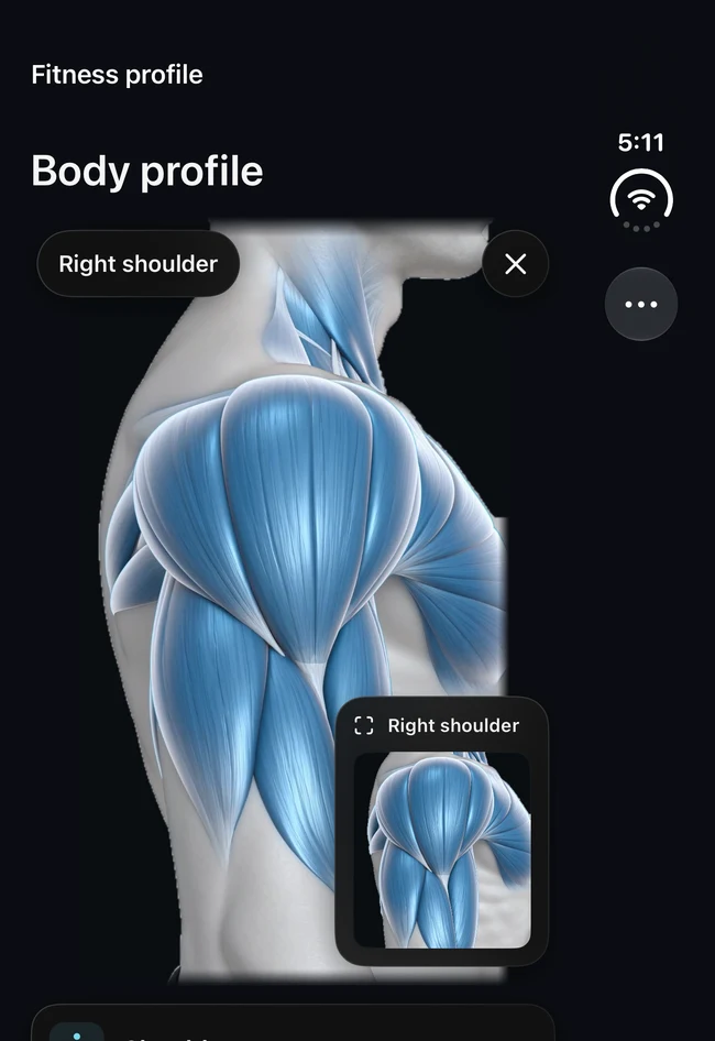
What should happen after that tap? Zooming the whole frame made the arm bigger, but it didn't explain which part I had picked. I asked for blue fibres on the selected muscle and a small close-up of that same area. The two views have different jobs: the body gives you orientation; the inset gives you detail. I didn't want play or rewind buttons underneath. This is a way to explore an illustration, not a video to sit through, and it isn't a scan of the person holding the phone.
Glass has to work with the light off
I liked the pearl surface in the light theme. In dark mode the same treatment made the edge of the anatomy footage too obvious, especially during a zoom. My direction wasn't to darken the white screen. It was to give dark mode its own charcoal surface and soften the join around the figure. When I tap a shoulder, the first edge I notice should belong to the shoulder, not the video.
That became a useful rule for buttons, too. Put the reflection on the surface and the gradient on the rim; leave the number and label sharp. An inset control doesn't need a second layer of blur. With Reduce Transparency, the surface can be solid and still look like the same control. That's the part of the design system I care about most: what survives after the decorative effect is gone.
The Watch shouldn't need a second workout to operate
On the phone, there's room to look ahead at a plan. On the wrist, in the pause before the next set, I want the name of the exercise, the set I'm on, and one obvious action. My brief for automatic counting was simple: I shouldn't have to announce every transition between moving and resting.
But wrist motion is evidence, not a verdict. Holding a partial rep isn't the same thing as finishing a set. A machine can also let you move a load without moving your wrist very far. That's why I want an estimate the lifter can correct before logging; saving the target from the plan as if it were the measured count would be worse than asking.
We compared the current counter and a research model locally, using recorded motion with known set boundaries. That comparison helps decide what to test next. It doesn't tell me whether a Watch will find the start of a set when someone is adjusting a bench. I haven't treated the research model as a shipped accuracy improvement. The test I want is a real, consented recording alongside the count the lifter confirms.
The same rule applies to food
A food photo and a wrist movement seem like different design problems until you ask who gets the last word. A photograph can't tell you exactly how much oil went into a meal. The useful interaction is to propose a food and portion, show the calorie and macro estimate, and let the person change it before saving. A nutrition-label photo has a different job: read what's printed, then check the serving against what was eaten.
My contribution across these screens was deciding what the app should do for someone and where it should stop. Remove the menu when the body is already the menu. Remove the extra tap when a transition is clear. Keep the correction when the answer is still an estimate. Those are three different decisions, and no amount of polish makes them interchangeable.
Explore the FitProofs case study and its interactive glass design system.